Each year, Pantone’s Colour of the Year gives designers, marketers and brands a fresh source of inspiration — and for 2026, the spotlight is on Cloud Dancer.
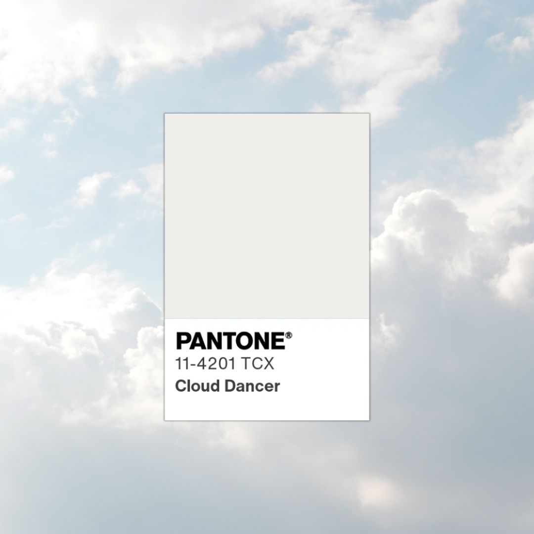
Setting the tone for branding and design in 2026
Soft, calm and effortlessly versatile, Cloud Dancer is a colour that works beautifully in print when used thoughtfully. In this blog, we’ll explore what Cloud Dancer represents and how businesses can use it effectively across their branding and printed materials.
Cloud Dancer is a light, airy neutral with a warm, modern feel. It sits somewhere between soft white and pale grey, making it incredibly adaptable across different industries and design styles.
Pantone describes Cloud Dancer as a colour that reflects:
In a world that still feels busy and noisy, Cloud Dancer offers a sense of breathing space — something many brands are aiming for in 2026.
Neutral tones like Cloud Dancer are often underestimated, but in print they can be incredibly powerful.
Unlike bright or trend-heavy colours, Cloud Dancer:
It’s especially effective when paired with quality paper stocks and finishes, where texture and contrast can really elevate the design.
Cloud Dancer works perfectly as a background for:
It keeps designs looking light and modern while improving readability — especially when combined with darker text or accent colours.

Luxury brands can use Cloud Dancer as a perfect background colour
If your brand leans towards minimalism or luxury, Cloud Dancer is an excellent choice.
It’s ideal for:
Paired with simple typography and plenty of white space, it creates a polished, confident look without feeling cold or clinical.
Cloud Dancer really shines when used alongside:
This makes it a great base colour for brochures, presentation folders and high-end marketing materials.
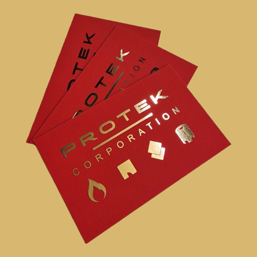
Use a muted background to make metallics pop
Using Cloud Dancer consistently across:
…helps create a cohesive brand identity. Consistency in colour usage is key to building trust and recognition, especially in print where quality is immediately tangible.
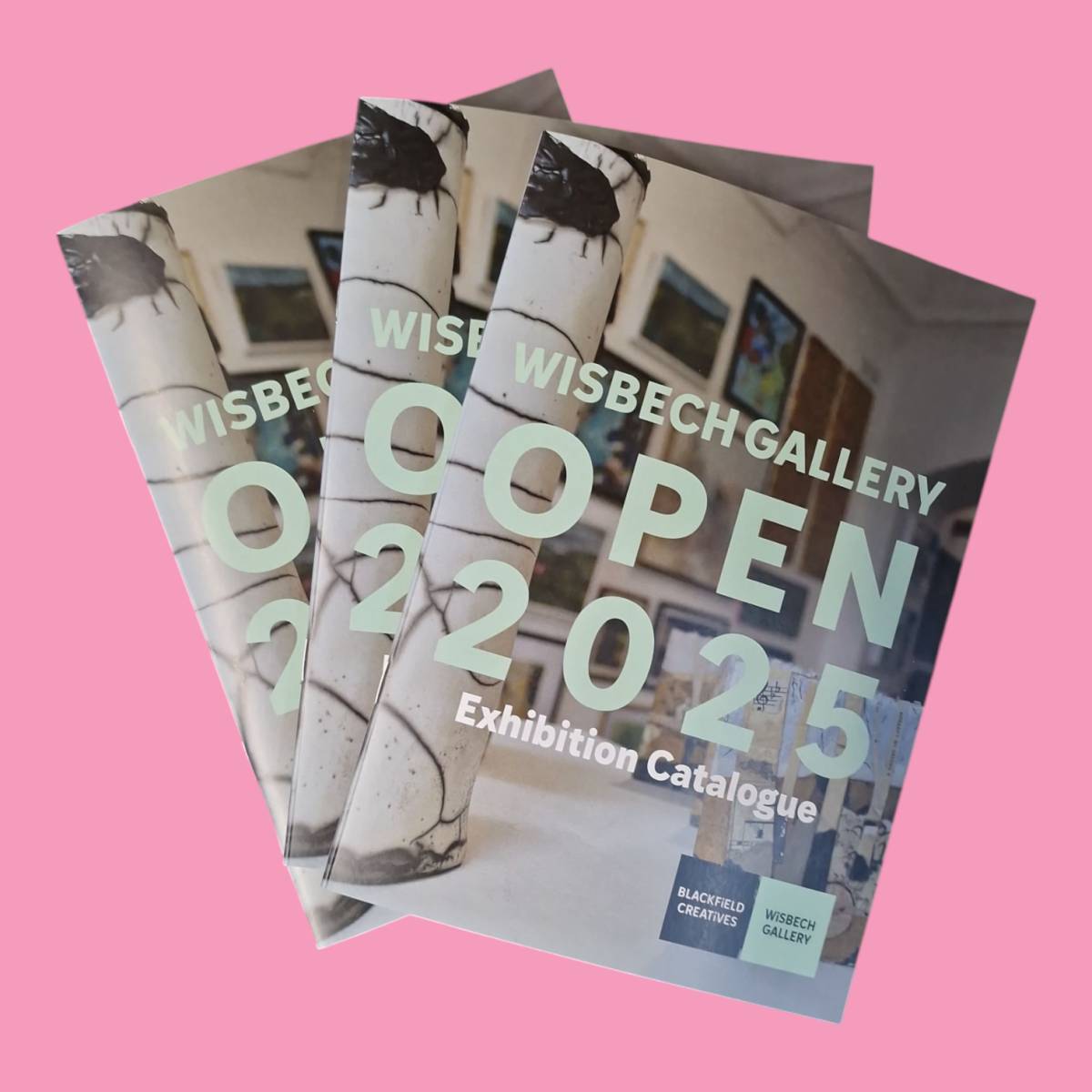
Add Cloud Dancer to your branding for a sense of tranquillity
Because Cloud Dancer is subtle, the paper stock and finish matter.
Some great options include:
This is where professional printing really makes a difference — ensuring colours are accurate and finishes complement the design.
Cloud Dancer isn’t about bold statements — it’s about confidence, clarity and timeless appeal. If your brand values:
…then Cloud Dancer could be a perfect addition to your 2026 branding and print materials.
Whether you’re refreshing your branding, planning new marketing materials or simply want advice on how this year’s Pantone colour could work for your business, we’re happy to help — from design through to print.
Get in touch to talk about your next print project.
